Email marketing can help you build better relationships with your patients, so they’re more loyal. It builds trust to increase case acceptance too. Plus, with Practice-Web’s mass email tool, pwNewsletter, it’s easy to build professional emails in minutes. Use the tips on this page to improve your results.
1. Use Email Marketing Templates

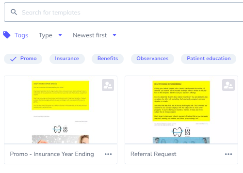
If you’re using pwNewsletter, you’ll have the option to create emails from scratch or select a template we’ve created for you. It’s best to start with the templates if you’re new to email marketing. They’re designed with conversion in mind, so it’s easy to create an email campaign that gets results quickly. Just swap out the words and links to fit your message.
2. Make Sure Your Email Looks Good on Mobile
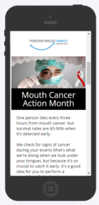
More than 70% of people read their emails on cell phones and other mobile devices per Campaign Monitor. When the email doesn’t display correctly, roughly 70% of people will instantly delete the message without even reading it.
If you’re using pwNewsletter, click the “mobile view” option in the toolbar at the top of the screen. Your email will then display in a cell phone, so you can make sure your mobile users will have a good experience too.


3. Give Readers Their Next Steps
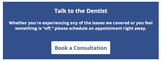
Regardless of whether you’re sending a newsletter, promotional campaign, or something else, always tell your patient what to do after they finish reading the email. This is referred to as a call-to-action or CTA in marketing.


In the examples above, we’re using online scheduling links along with buttons that stand out, so the reader’s eyes are naturally drawn to the action they’re supposed to take. Your CTA can be different than the ones we include. For instance, you might prefer a “read more” button on a blog or a link to an online form for appointment requests if you don’t have online scheduling. Experiment with different ideas to see what your patients respond to. You can also use A/B tests to put different CTAs up against each other in a head-to-head match to see what works best.
4. Make Your Emails Accessible
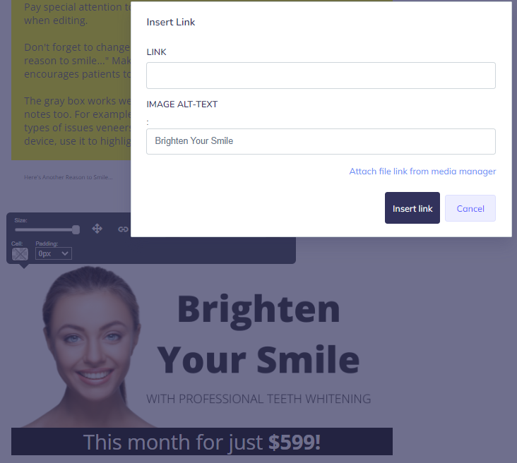
You will have some readers who see colors differently and some who can’t read your emails at all and, instead, use special software that reads your content out loud to them. Use high-contrast colors and avoid certain combinations like red and green to make your content easier to follow. When you add an image, describe it and include any text seen in the image in the alt-image tag. In pwNewsletter, it’s accessed by clicking the image, then selecting the link icon. Anything written in the “image alt-text” field will be read out loud to those using screen readers. As a bonus, email programs will also notice you’re following best practices and are more likely to place your message in an inbox rather than a spam folder.

5. Use Layman’s Terms Instead of Dental Jargon
Patients don’t usually speak in dental terms. That’s why Practice-Web includes a “Layman’s Terms” feature that allows you to automatically swap out dental jargon on patient-facing communication. For instance:
- “Prophy” can become “Cleaning”
- “Recall” can become “Checkup”
- “Composite” can become “Tooth-colored filling”
If you’re not already using Layman’s Terms, you can add them inside individual procedures, from the Procedure Code settings.
Take the same approach with your emails to ensure patients can easily follow what you’re saying and take action.
6. Use Consistent Branding
If your practice has a website, carry over elements like colors, fonts, and your logo from there into your emails. If you don’t have a website yet, decide what elements you want and use them consistently. This helps patients recognize your emails, so they’re more likely to read and click. It also increases familiarity and trust, plus makes your campaigns look more professional.
7. Be Selective with Images
Images make your content more visually appealing and can increase engagement. However, if you have too many images or the bulk of your message is an image, your email is gong to look like spam. It’ll provide a poor experience for mobile users and those with different abilities too. Plus, some email programs don’t display images by default, which means those readers will likely ignore your message as well.
Try to follow the 60/40 rule. Make sure your emails are at least 60% written content and no more than 40% images to provide a better experience.
8. Opt for Education Over Sales
The goal of email marketing is to boost trust and loyalty, so most of your emails should be focused on education. For instance, teach your patients about oral health and gum disease, let them know about technology in your office, and discuss options in dental care. If you’re doing this part well, they’ll appreciate the occasional sales-focused/ promotional email too.
9. Schedule Your Email Marketing
Email marketing is a form of content marketing, which performs better when managed on a schedule. It’s best practice to create a calendar in rolling three-month cycles that include all your content marketing initiatives such as blogs and social media posts too. That way, you can capitalize on any major events happening, coordinate your content into specific themes, and can block out time for the actual creation of your pieces to ensure they release on a schedule. Once you’re on a schedule, your patients will start to look for your content during normal release times too.
Get Help Boosting Your Email Marketing Results
If you’re using pwNewsletter and want a refresher of the email marketing tool, connect with our Support team.
Not using pwNewsletter? Sign up directly through our pricing page.
Not using Practice-Web? We’d love to give you a tour! Request a demo to get started.

